
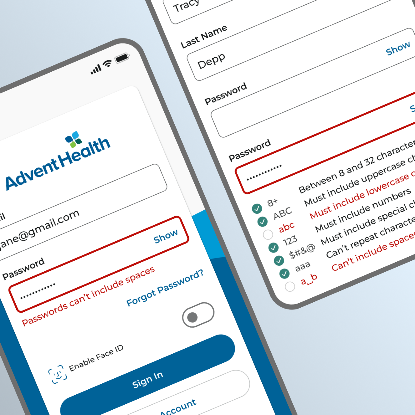
Key contributions to AdventHealth’s 50+ page design system.
- Interaction Design
- Motion Design
- UI Components
- Design System Documentation
- Product Design
- Product Strategy
Chat Container
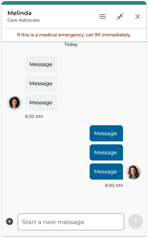
The chat container unifies all chat components, encompassing both content and conversation.
It consists of a header, content section, and composer.
This component can be used for designing chat bot and live agent experiences within the AdventHealth patient portal.
Chat Header
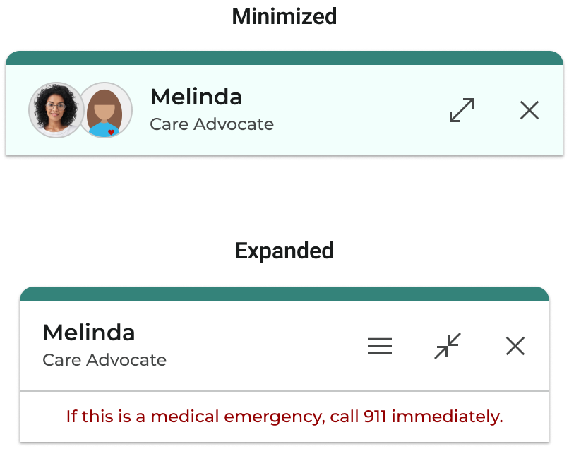
The chat header occupies the top section of the chat component. Displaying essential information such as the name, status, and actions. The chat header has two states:
Minimized: When users are not actively interacting with the chat conversation, the header appears persistent on top of the content. The minimized header indicates the chat status of a collapsed conversation while navigating to other parts of the product.
Expanded: The header of an open chat conversation is affixed to the top of the chat container and includes the name, status, and additional actions relevant to the expanded version.
To enhance consistency across all platforms, the design & content of the mobile chat header and the web chat header are identical.
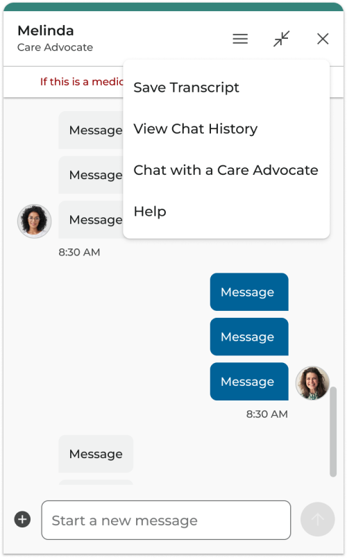
Header Menu
The chat menu will appear below the menu icon when the icon is selected. The right of the menu should be 16px from the right side of the chat window. If the user selects outside of the menu or selects the menu icon when the menu is open then the menu will close.
For unauthenticated users, the menu won’t include View Chat History.
Placement - Web
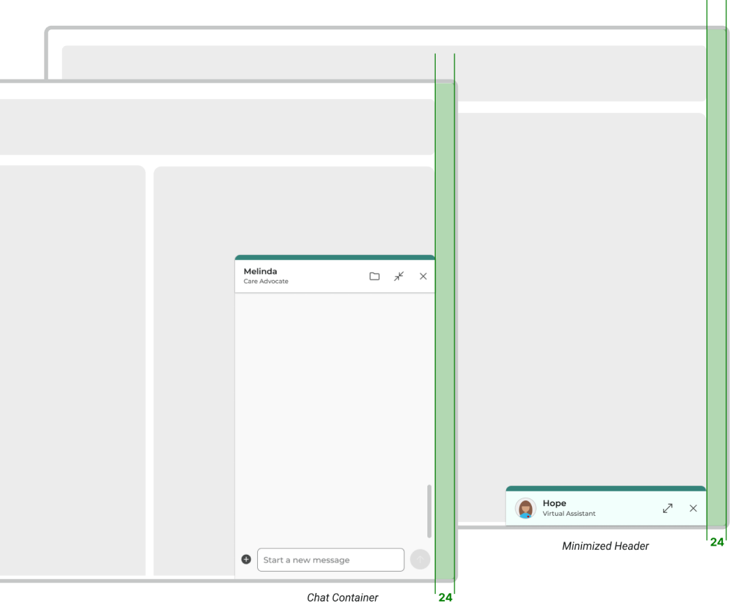
On the web, the chat container is anchored to the bottom-right with a right-padding of 24px.
In its expanded form, the container is a fixed width of 395px and a fixed height of 640px.
When minimized, the chat header remains anchored to the bottom-right and stays visible as users navigate between pages.
Placement - Responsive Mobile
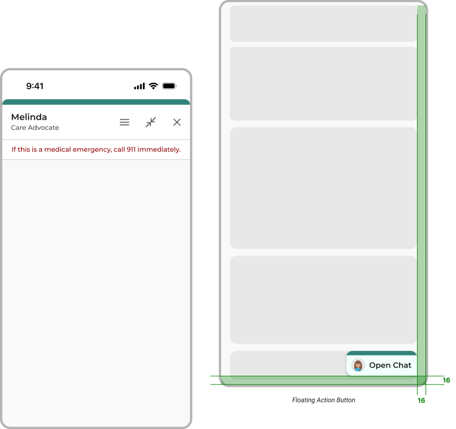
On responsive mobile, the expanded chat container occupies the full screen of the device.
When minimized, the re-entry point becomes a Floating Action Button 16 px from the bottom and right side of the screen. The FAB stays visible as users navigate between AdventHealth Account pages.
Review the Floating Action Button documentation for specifics on the component behavior.
Chat Composer
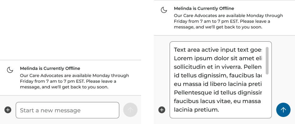
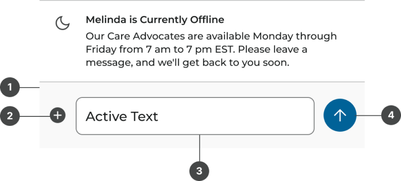
The chat composer is the input area anchored to the bottom of the chat container, where users can type messages and attach files.
The "Send" button remains disabled until the user begins typing.
There’s no character limit for messages in the composer, but the input field is capped at a maximum height of 216px.
For longer messages, a scrollbar appears to accommodate the overflow.
Keyboard submission should be enabled, allowing users to send messages using their device’s keyboard, such as pressing "Enter."
Composer Anatomy
- Container
- Attachment Icon Button
- Text field
- Send Icon Button
Chat Content
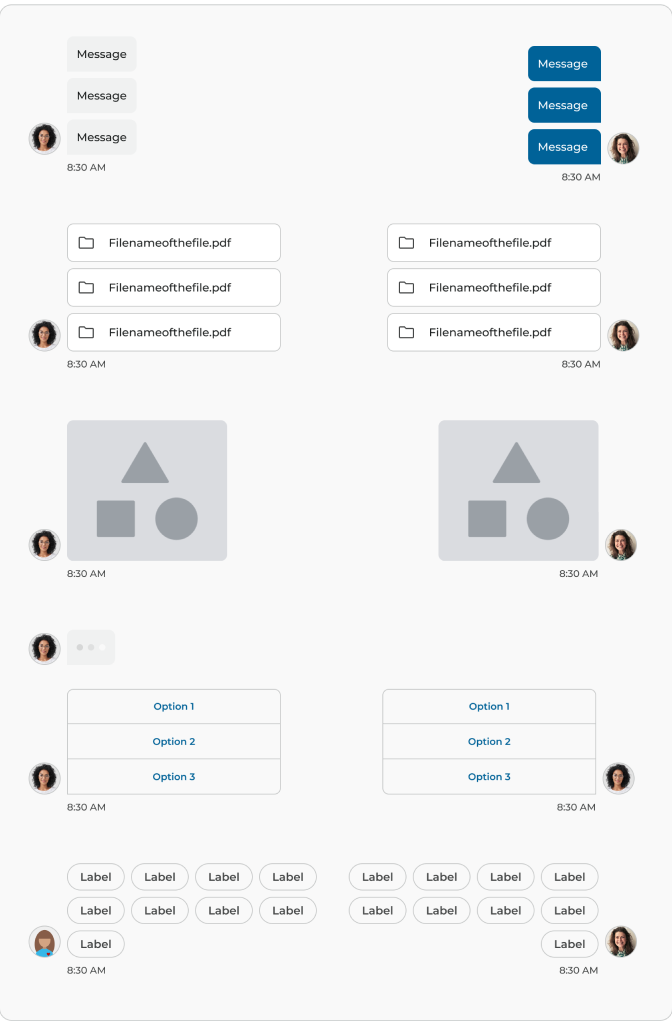
Each chat is made up of interchangeable bases, where each bubble is either inbound or outbound.
Bases are designed to accommodate flexible content, such as messages or loading animations, within any base—whether inbound or outbound.
Bases can also be content outside the bubble, such as media or attachments.
Stamps mark important timing or context.
Inbound & Outbound Messages
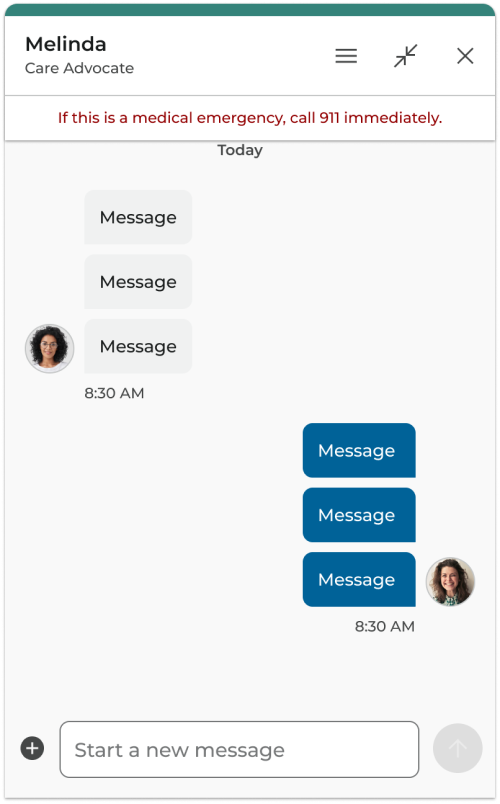
Outbound (user) are the brand color and are aligned to the right.
Inbound (Chat Advocate/Hope) are a neutral color and are aligned to the left. Name stamps are attached to the top of inbound message groups.
Consistent padding inside the bubbles and proper spacing between them enhance readability.
Each message includes a timestamp to provide context.
Failed messages display a clear error message under the message, with an option to resubmit.
Spacing & Padding
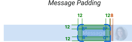
Message Padding
- Avatar & Bubble Padding: 8px
- Bubble Padding: 12px
- Corner Radius: 8px, Bottom Right 0px
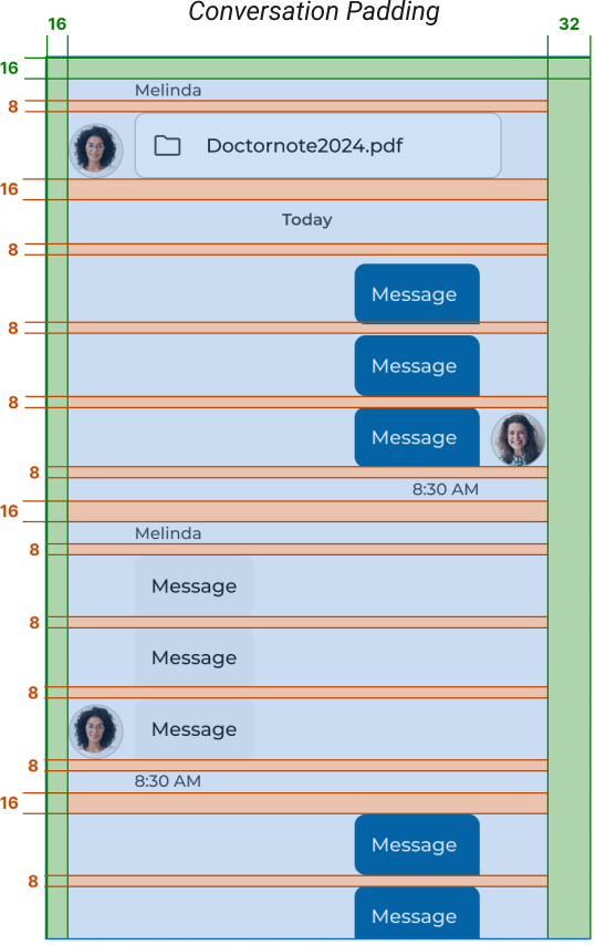
Conversation Padding
- Chat Message Padding: 16px
- Multiple Message Padding: 8px
- Right Scrolling Padding: 32px
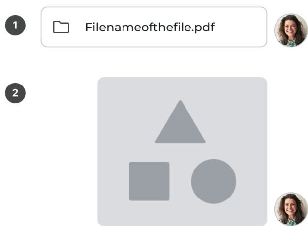
Attachments & Media
- Attachments
- Attachments should support various file types (PDFs and documents, with size limitations of 20 MB)
- When an attachment is uploaded, it should display as a rounded list within the chat bubble, with the option to download when clicked.
- All Failed uploads display a clear error message as a snackbar.
- Media Attachments
- Images and Videos
- Media behavior includes image previews that expand when clicked
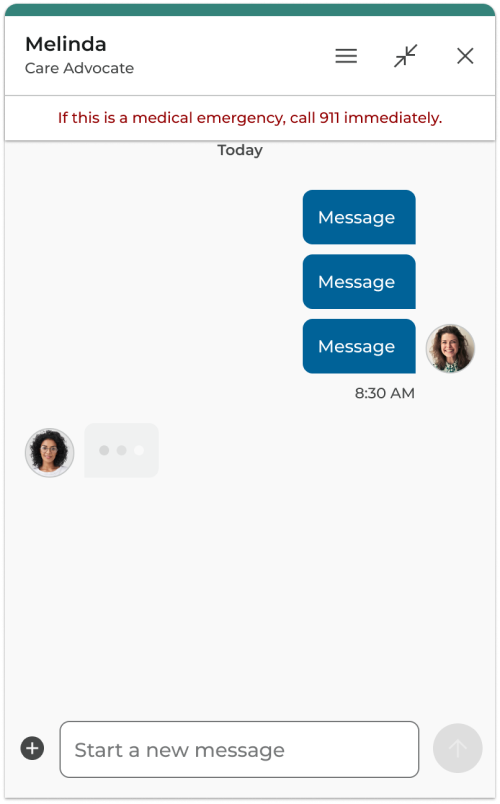
Typing Animation
Typing animations in chat indicate when someone is typing, creating a sense of real-time conversation and helping reduce the anxiety of waiting for replies.
The chat circles animation uses a staggered effect, in which each circle appears sequentially with overlapping animations. Each bubble scales from 0% to 100%, but the timing varies for each one.
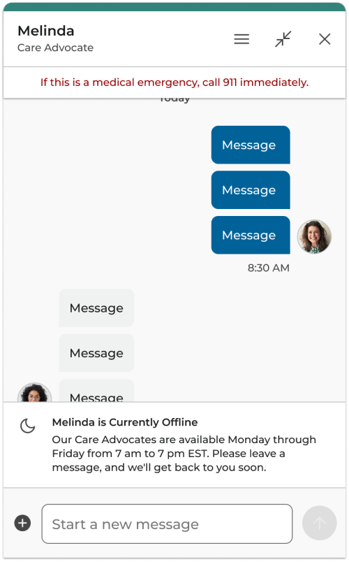
System Messages
Convey information related to the platform's status, such as surveys, offline alerts, or updates about the chat environment, and are not specific to individual users or agents.
Filter Chips
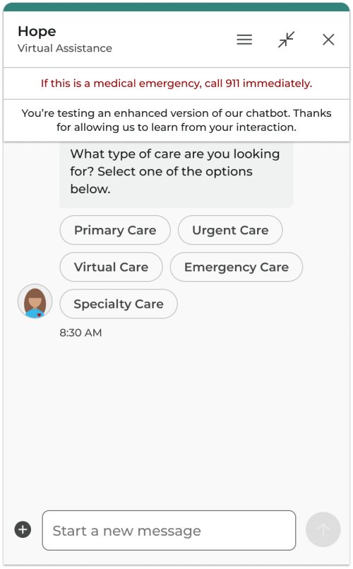
Filter chips allow users to scan multiple options to quickly make a decision.
Feedback Icon Buttons
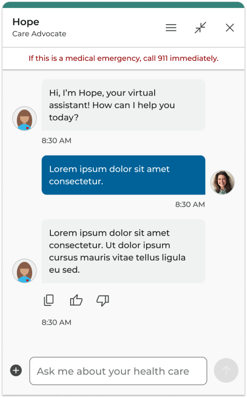
These icon buttons provide a low-friction and lightweight opportunity for quick feedback on the helpfulness of Hope’s responses. Feedback icon buttons will appear below any AI-generated message that Hope shares with a patient. They will not appear below pre-written content or adaptive cards within the chat.
These icon buttons include: copy, thumbs up, and thumbs down. Their styling is intentionally minimal and neutral to avoid distracting from the conversation or emotionally swaying the patient in any direction.
Feedback Icon Button Behavior
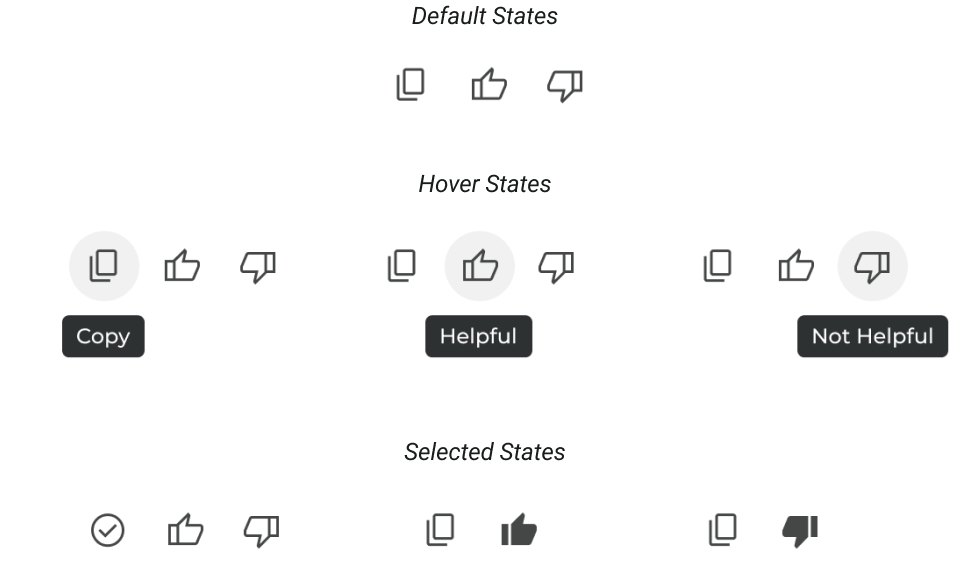
- Hover Behavior: When hovered over, the icon button takes on a gray background, and a tooltip will appear aligned to the center and 8px below the corresponding icon. See Tooltips for more documentation.
- Copy Icon Button Pressed Behavior: When selected, the icon button will change to a check mark icon for 800ms, then revert to the default copy icon.
- Thumb Up/Down Behavior: When one of the thumb icon buttons is selected, it will become filled, and the opposite thumb icon button will disappear. If the selected icon button is pressed again, it will return to its outlined state and the opposite thumb will re-appear.
- ARIA Labels: “Copied”, “Helpful Selected”, “Not Helpful Selected”.
Quick Actions
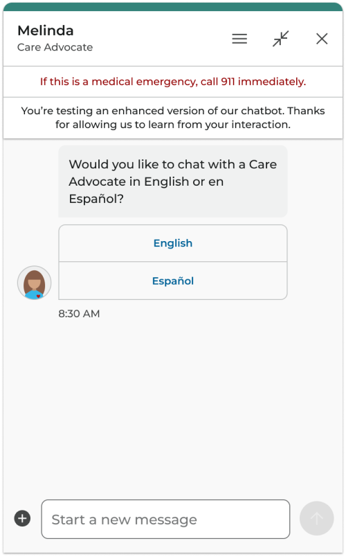
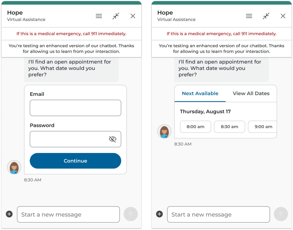
Quick Actions are interactive buttons designed to facilitate user choices and streamline their journey within the chat interface.
These components are tied to specific user actions, such as scheduling appointments, selecting time options, or completing surveys.
Chat Adaptive Cards
Adaptive Cards are interactive chat elements used to gather user input through fields, display important information for verification, and provide opportunities for a call to action.
Floating Action Button
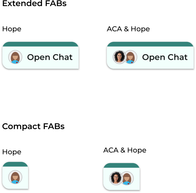
For our product’s use case, we will be utilizing the framework of M3’s FAB guidelines with slight variations for a minimized entry point to our Hope and Care Advocacy chat.
Although our Chat FABs may not always be the primary action on every page they appear on, they can however be considered most relevant. This is because they appear when a user has an ongoing chat conversation in the background.
Chat FABs have two states (extended and compact) and two avatar types (Hope and ACA & Hope).
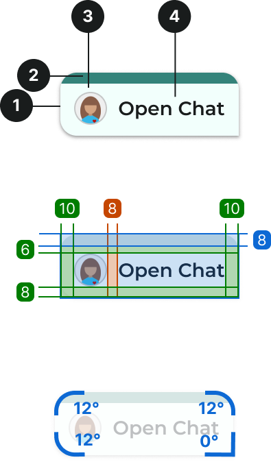
FAB Anatomy, Spacing & Padding
- Container
- Top border
- Avatar
- Text label
- • Item spacing: 8
- • Top border hight: 8
- • Padding top: 6
- • Padding bottom: 8
- • Padding left: 10
- • Padding right: 10
- • Border radius top left: 12
- • Border radius top right: 12
- • Border radius bottom left: 12
- • Border radius bottom right: 0
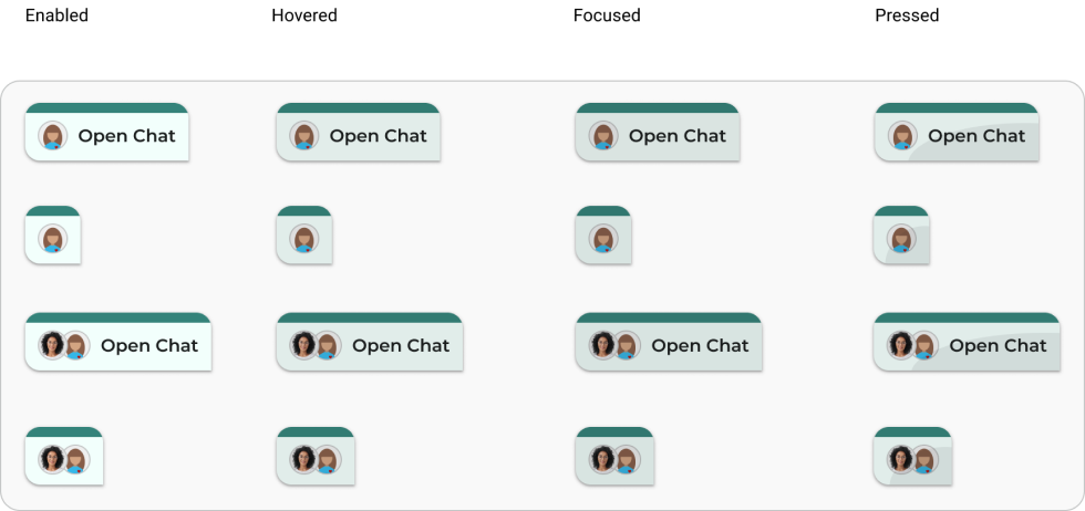
States & Behavior
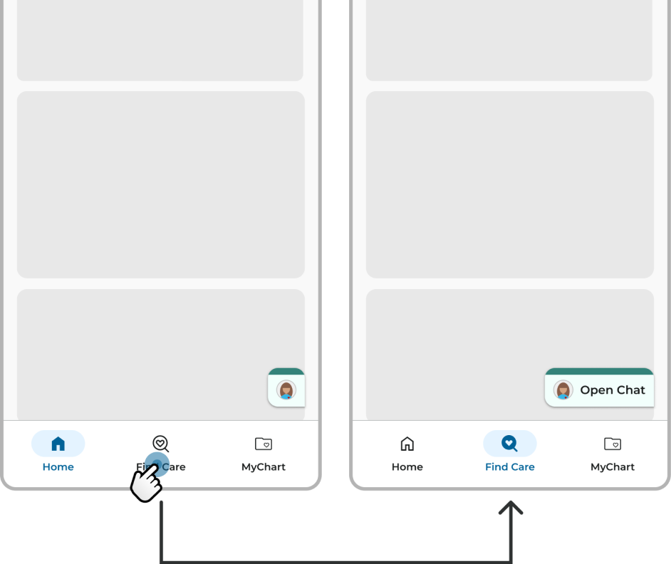
When the Chat FAB first appears on the screen it will be in it’s extended state. After a delay of 800ms it will change to its compact state.
The FAB will return to it’s extended state when the user reaches the bottom of a page or screen. As they scroll back up, the FAB will become compact again.
Loading Behavior Across Pages
When moving from page to page, the Chat FAB should disappear and reappear like seen in the M3 example here.
One difference from what’s seen in M3 is every time our Chat FAB appears again on a new page, its default state should be extended and then change to compact after 800ms. See previous page for an example of this.
If the FAB loads on a page that doesn’t have any scrollable content, then the FAB will still initially be in it’s extended state before changing to compact after 800ms.
Notification Badges
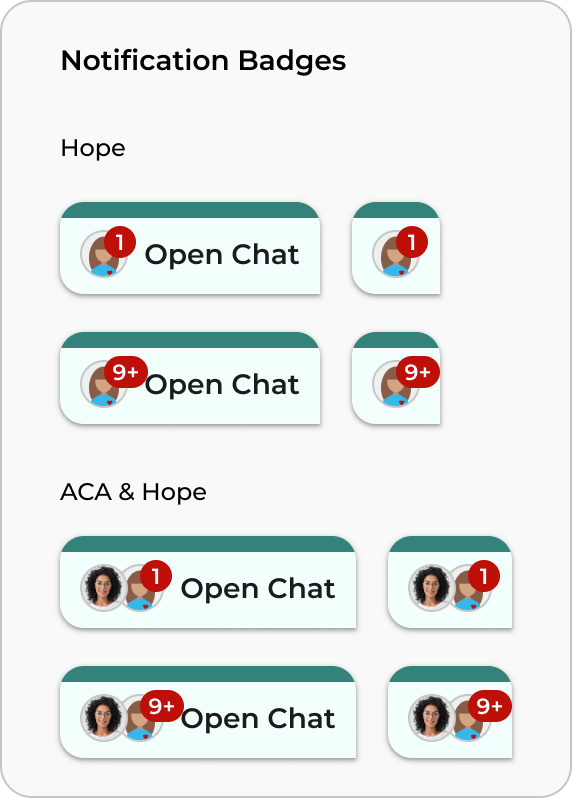
If a message is sent from Hope or a Care Advocate while the chat window is minimized, then a notification badge will appear on the FAB.
Each notification will accompanied by a bounce animation for the FAB.
If there are 10 or more unread messages then the notification badge will show “9+”.
Chat Entry Points - Mobile
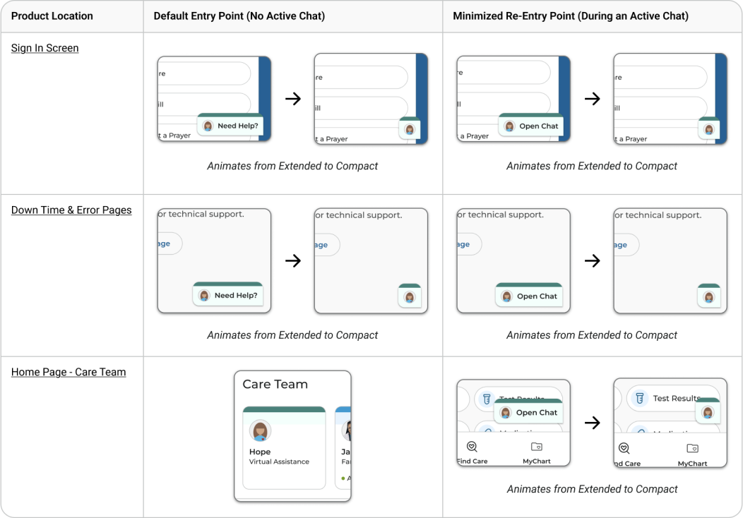
On Mobile, the default entry point and minimized re-entry point will also differ depending on the location in the product.
Take note that any compact FABs documented will follow the States & Behavior section.
*The FAB stays visible as users navigate between AdventHealth Account pages.
Chat Entry Points - Web
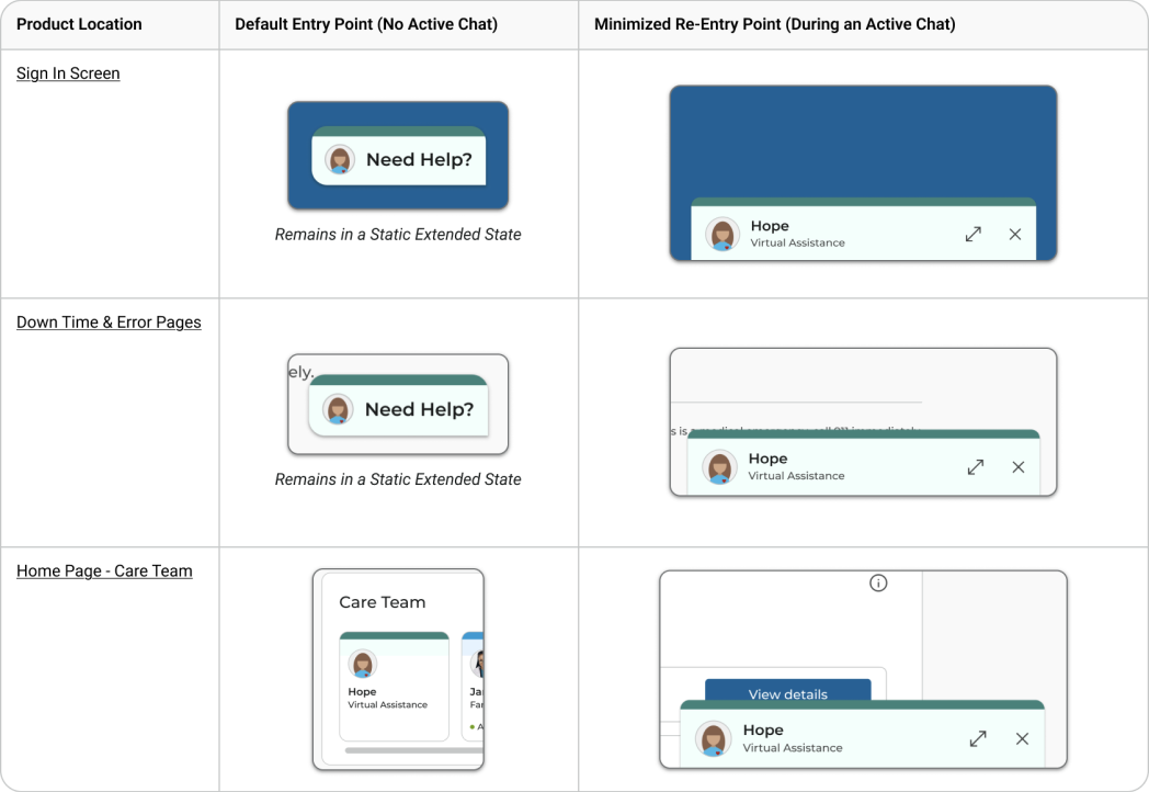
Our product includes multiple chat entry points, with specific re-entry points for users who minimize an ongoing chat.
On the Web, the default and minimized re-entry points will vary based on their location within the product.
On AdventHealth.com, the FAB will follow the same behavior as on the sign in screen.
*The minimized chat header stays visible as users navigate between AdventHealth Account pages.
More Case Studies
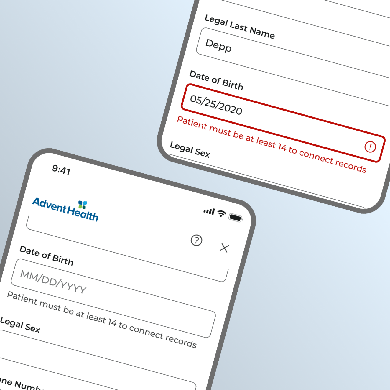
Clear age requirements decrease patient frustration while lowering related support calls.